  |
 |
 |
 |
![]()
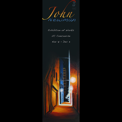
_____Even at twelve feet tall, a poster can be dwarfed by the Atrium's size if not placed well. However, when the space right across from the doors is free, such a print is quite imposing. Even better that this was an exhibit poster - because they can be very, very simple and to-the-point compared to a lecture poster which must contain lots of information. Name. Location. Date. Image. That's it. I liked how clean this poster looked compared to the busy mess I had to make for the PostSecret event. There were two paragraphs of rules on a nine foot tall poster. That sounds like a lot of space - but seriously - no one wants to read all that on their way to class. As for Newman's paintings, they're awesome. They all have that oversaturated, surreal glow of an over-exposed photograph and yet go even farther with color and texture on canvas. Of course, in the case of all the posters I did on behalf of UT, all logos and images are copyright their respective owners, and are only used here to show context. The logos are the smallest thing on the poster, and even the 50% size detail does a decent job of showing how big the whole thing is. Of course, I did not design the ubiquitous UT logo, nor did I design the CPC (Central Program Council) logo. However, both of these groups were invovled in this event, and requested that they be represented as such. |

 |
|
 |
|
 |