  |
 |
 |
 |
![]()
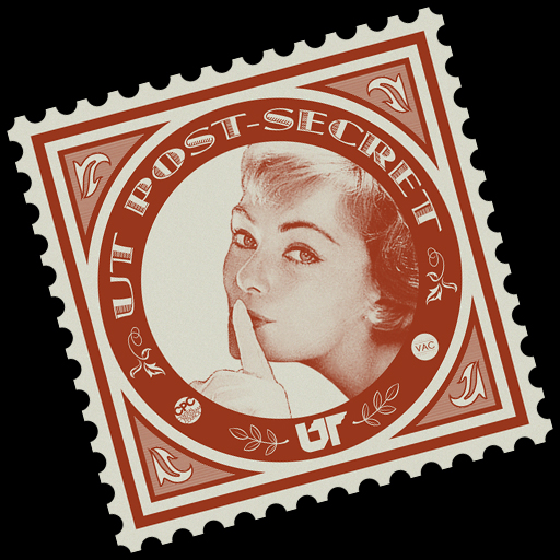
_____I developed this logo for a submission-based gallery show sponsored by the VAC at UTK. Based on Frank Warren’s books and website called Post Secret, the Visual Arts Committee’s event consisted of visually-represented secrets on the back of post cards. This took place right around Valentine’s day, so the VAC crew wanted the submissions to be pretty steamy, so as to suit the theme. They wanted some scandalous love secrets. It was with this that I went about designing the UTPS logo. It was to be presented three-feet-wide on a nine-foot-tall banner for a few weeks before the event, so I wanted to put a lot more detail into it than I would for a normal logo design. Mouse-over for a detail. I knew I wanted to base the logo on stamps from the early industrialized era, because I see them as iconic of the mail system in general - and this event is very much about the mail. From there, I set about to find a coy image of a girl saying “shh!” A few hours later I came across the perfect one, though try as I might I couldn’t find out any information about this pretty lady that knows something you don’t know. Since the poster wasn’t associated with anything that brought revenue or publicity, and given its apparent age, I figured that fair use covered the image well enough. If I’m wrong... I guess I’ll find out! For those curious: yes, we got lots of scandalous submissions - some too much to show! |

 |
|
 |
|
 |